THE HATCH
~
THE HATCH ~
Visual identity for a street food kitchen serving up dishes with rough edges and punchy flavours.
Project overview
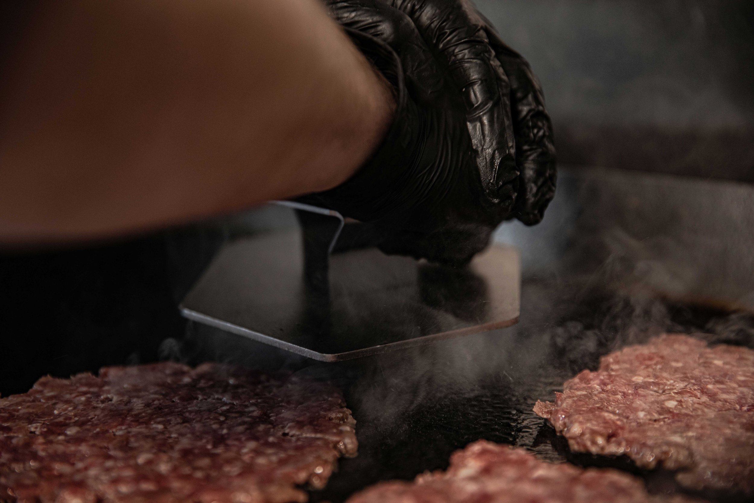
The Hatch offers a unique and memorable culinary experience that combines simplicity and flavour, using fresh ingredients from local suppliers. Via the brand identity, The Hatch seeked to establish a strong connection with customers, build brand loyalty, and ultimately become a sought-after destination for food enthusiasts.
Services
Naming
Brand Strategy
Visual Identity
Content Creation
Web Design

-
We conducted a comprehensive analysis of the street food industry, including market trends, customer preferences, and competitor analysis. Identified gaps and opportunities within the market to inform our brand strategy.
This helped define the target audience for The Hatch, considering factors such as local demographics and their eating habits. We conducted surveys, interviews, and market research to gain a deep understanding of the target audience's preferences and expectations.

-
We worked to identify key differentiators that set The Hatch apart from local competitors. This led to exploring unique aspects of the street food kitchen, such as its menu offerings, culinary approach and ambiance to create a distinct brand positioning.
We developed a compelling value proposition that communicates The Hatch's unique benefits to its target audience. Emphasis was placed on aspects such as high-quality ingredients, diverse flavours, personalised customer experiences and sustainability practices.
The brand promise formulated was clear and memorable that encapsulates what customers can expect from The Hatch. A promise that aligns with the brand positioning and addresses the target audience's needs.
-
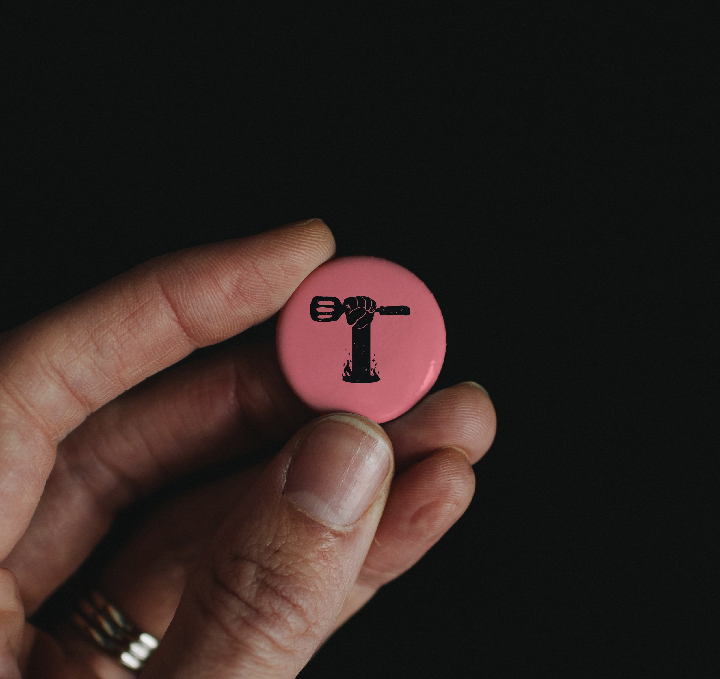
We evaluated various options for the brand name and selected "The Hatch" to evoke a sense of discovery, excitement, and surprise while reflecting the concept of a street food kitchen.
From the name we developed a visually appealing and distinctive logo that embodies The Hatch's brand essence. Consideration went into elements such as typography, colour palette and graphic flourishes that push the brand's personality, values, and positioning.
With a flexible approach to a diverse street food menu, we wanted the logo to be symbolic of the nature of the Hatch offering, but also leave some ambiguity and not to focus on a particular menu item. The hand appearing out of the portal (hatch) holding the spatula felt like the perfect solution.


“Hatch is all about uncomplicated, tasty grub. Food that incorporates simple ingredients but is full of flavour. We strongly believe in using quality produce from local suppliers with a passion for their craft.”

-
We crafted a consistent brand messaging framework that effectively communicates The Hatch's brand values and the overall brand experience. This was rolled out across various touchpoints, including social media, website, and promotional materials.
We outlined a content strategy that aligns with The Hatch's brand voice and positioning. Developed a content calendar encompassing engaging and informative content, such as food stories, behind-the-scenes glimpses and customer testimonials.
With social media being a key element, we created a digital presence strategy to optimise The Hatch's online visibility. Identifying the appropriate platforms to engage with the target audience effectively was crucial and ensured consistent messaging across all digital touchpoints.